
Suliman Raqy
Eight Questions by Soraya
To start simply: where are you from, and where are you based now?
I'm Eritrean, born and raised in Jeddah, Saudi Arabia, and I'm currently based in London. Jeddah is where I first made and exhibited work and studied traditional Islamic arts; London is where I've been able to study curating, work in a gallery, and begin writing about art as well as making it.
How did art first enter your life — was there a moment you can point to, or did it arrive gradually?
Gradually, then deliberately. I felt a strong pull towards the visual arts early on, but for years it was instinct: I made things because I needed to. Around 2014 I began treating it as a practice rather than an impulse, asking what a work is for before deciding what it is made of. I've followed that path mostly outside traditional academia, through workshops, experiments and, in 2023, a curating course at City. The questions came first and the vocabulary followed, which is probably why my work still begins with an idea and only then goes looking for a material.
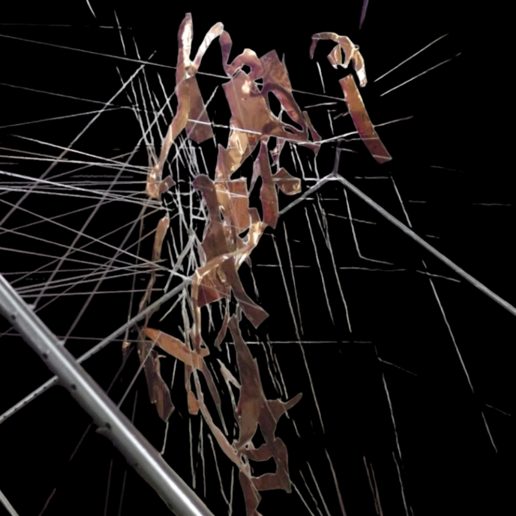
Poverty & Ignorance, 2016
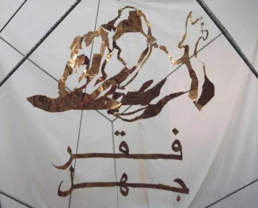
Poverty & Ignorance, 2016
You write that Poverty & Ignorance came out of the countries you've travelled through. When did those observations stop being something you noticed and become something you had to build — and why sculpture rather than photographs or writing?
There wasn't one day. Across the countries I've visited I kept seeing poverty and ignorance appear together, each feeding the other, and I noticed that describing them separately, in a photograph or a paragraph, always pulls them apart. What I wanted to say is that they are entangled. Sculpture let me build that entanglement instead of describing it: threads knotted around cut aluminum sheets inside a cube, so the viewer has to move through the tangle with their own body to make sense of it. A photograph gives you one position; here, finding the position is the point.
Poverty & Ignorance only resolves into an image from one precise angle — and what resolves is Arabic script. Is that also a statement about language itself: legible from one position, chaos from every other?
Partly, though I would separate two things. The viewer needs to find the right position: from most other angles, the image dissolves into threads and fragments. But there is a second condition, which is literacy. What emerges from the correct viewpoint is the two Arabic words فقر and جهل — poverty and ignorance. For someone who cannot read Arabic, another layer of illegibility remains. I think that adds something important to the work, because the problem is not simply what we see, but what we are able to understand.
Arabic was also the natural choice for me. It is my mother tongue, and I value its concision and clarity, which suit a work concerned with the moment something becomes readable. I wasn't trying to suggest that language is chaos except from one particular angle. Rather, I wanted to suggest that understanding is not automatic. It depends on where we stand, what we know, and whether we have the key needed to read what is in front of us.
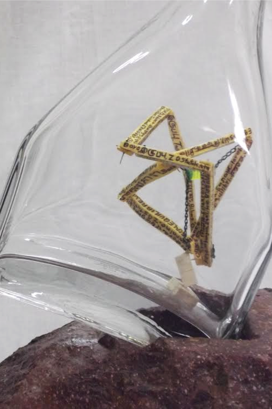
Balance, 2016
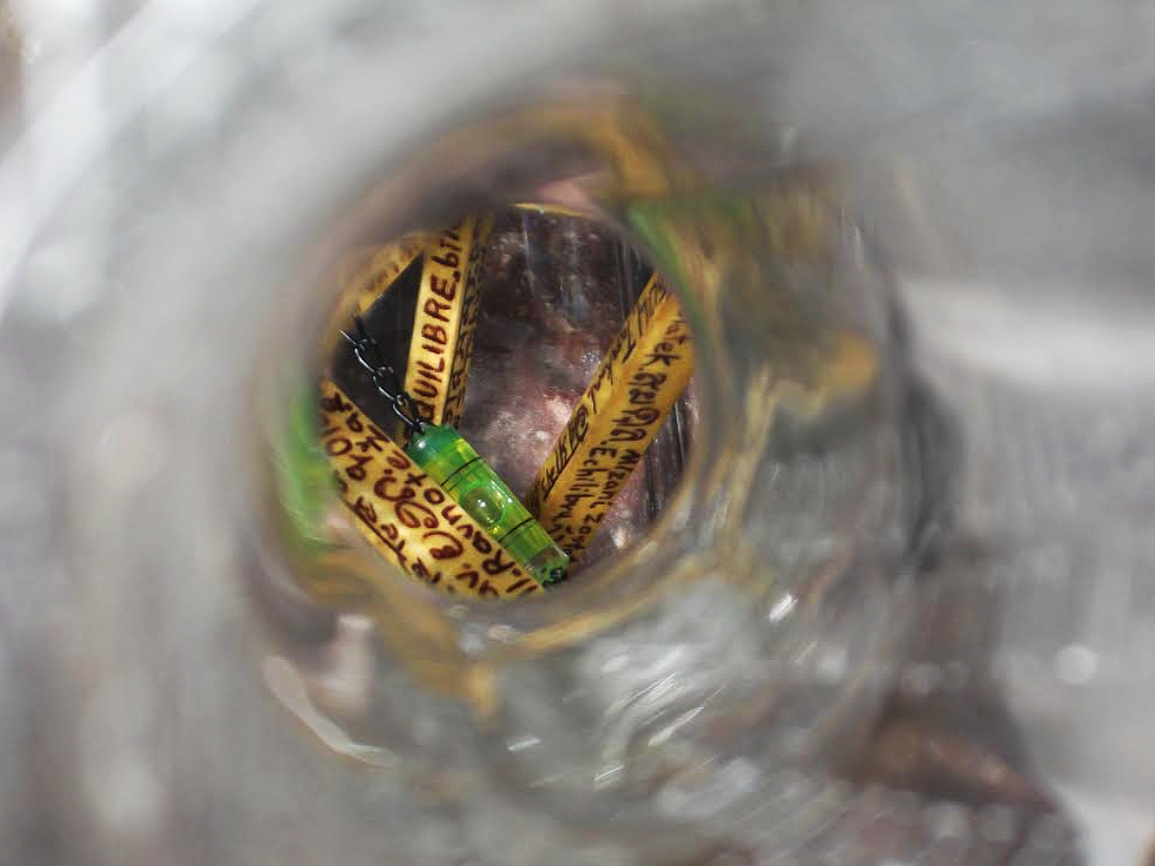
Balance, 2016
In Balance, everything is uneven except the water, and the word is engraved in over fifty languages. Was that piece describing an equilibrium you had actually found, or one you were arguing for?
Closer to an argument than a discovery: I can't claim to have permanently found it myself. Everything in the work is unstable: the frame is uneven, the chains are different lengths, representing the distances we keep — physically or emotionally — from people, problems, and events, and the overall setting is asymmetrical. Yet the water remains level.
For me, that became a metaphor for the possibility of maintaining some degree of inner stability even when our surroundings are not stable. But unlike the water, we have to keep adjusting. Balance is not something we achieve once and then possess; it requires constant attention and recalibration.
That is partly why Balance developed into a series rather than remaining a single work; I never feel I have finished with it. Each piece can be shown alone and carries its own weight, but together they mean something different. In the more recent The Measure of Perception, for example, I built a spirit level into the temple of a pair of spectacles. The level becomes an instrument of calibration, while the spectacles bring perception itself into the question. The work begins with the words "Look at us with one eye," which is an invitation to consider whether we can look at things evenly, without allowing one side to dominate the other.
The word Balance is engraved in more than fifty languages because I don't see the search for balance as belonging to any one culture. The word changes, but the human need it describes does not.
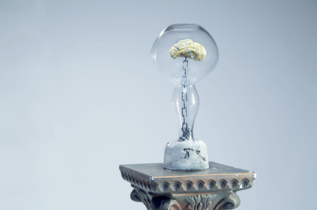
Stereotyped Minds, 2015
Stereotyped Minds puts a brain inside a glass vessel; your recent piece seals a pair of glasses inside a bottle. Both show something visible but unreachable. What draws you to the sealed container rather than the cage or the wall?
Because glass lets you see and denies you touch, which is close to how most of what I care about works. A cage or a wall says "you may not see"; a sealed vessel says "you can see everything, and it changes nothing." It is also how I think about ideas that have stopped being discussed: visible everywhere, yet no one handles them. The brain in Stereotyped Minds is sealed as much as it is confined. I explored the same thing with a lock instead of glass in a work I haven't been able to exhibit, Outside the Frame: an iron gate with an old lock, set inside a picture frame turned inside out, questioning the settled idea that art means a framed painting. In my recent piece, The Measure of Perception, part of the Balance project, the spectacles are aligned with the bottle's narrow neck: not sight, but insight. It's a form I keep returning to: in 2013 I made two early pieces, a ship inside a lamp and another inside a jug. I do use walls too, and The Dark Side of Wall Street is one, but there the wall hides something. The bottle hides nothing, which I find more uncomfortable.
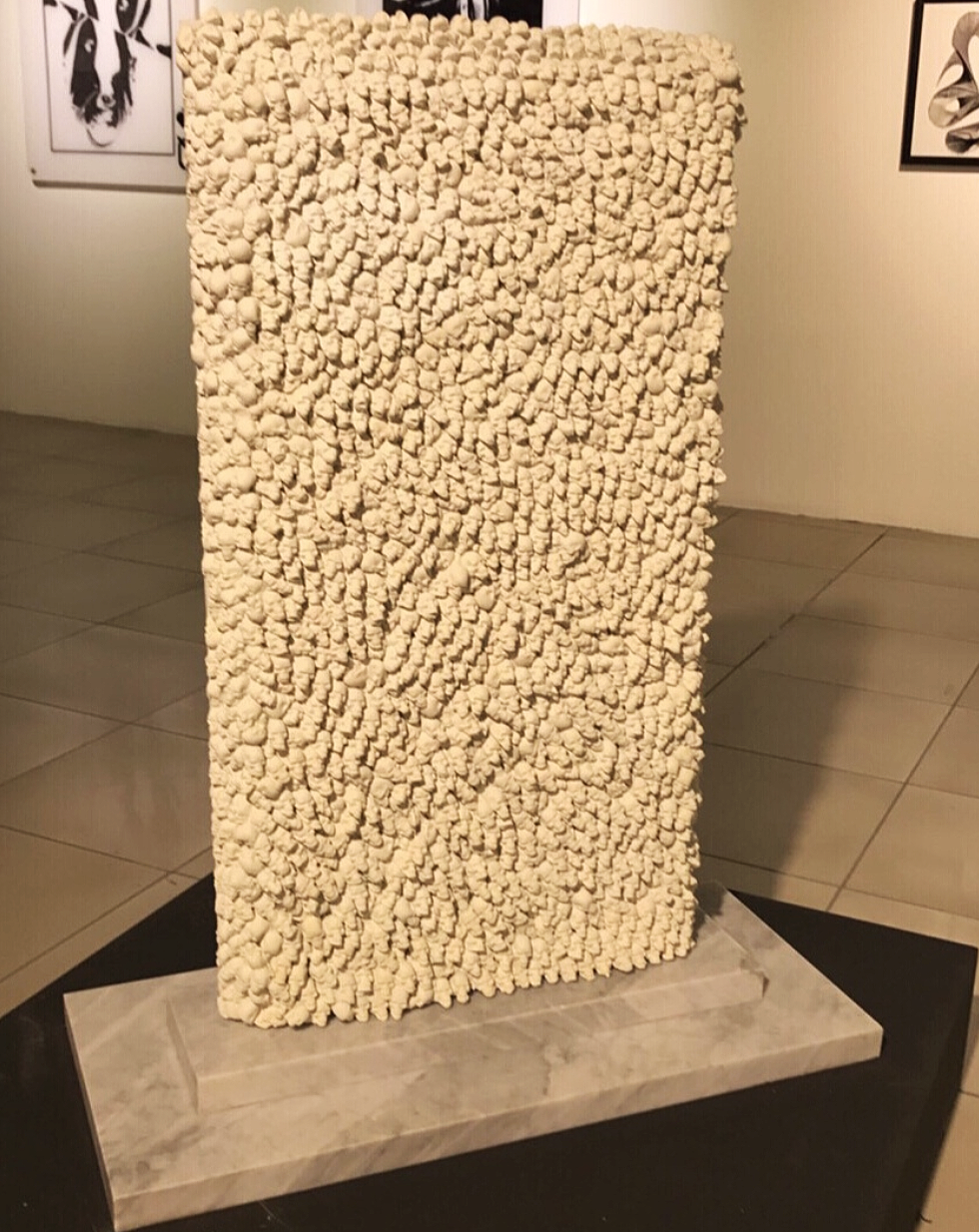
The Dark Side of Wall Street, 2016
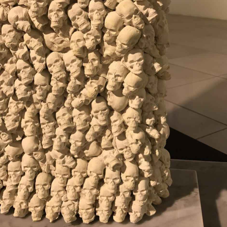
The Dark Side of Wall Street says exactly what it means, at a moment when much contemporary art prefers ambiguity. Is that legibility a deliberate position — and has it ever cost you something with curators?
Yes, the directness is deliberate, although I would distinguish between being clear and being simplistic. The polished marble face is designed to seduce: it is smooth, authoritative and glamorous, reflecting the image of power and prestige associated with finance. It is the reverse — the mass of human skulls — that speaks more directly about what can exist behind that surface.
The work is not intended as a criticism of trade or finance as a whole. Some kinds of commerce do rest on victims behind a glamorous, deceptive front, and the work focuses on those specific practices and their human consequences, including the exploitation of labour, pharmaceutical monopolies and war profiteering. The question for me was what lies behind a successful and attractive public image, and what that success costs.
I don't think seriousness in art requires obscurity. I want my work to remain accessible to people who do not have the vocabulary of the art world, because I don't believe art should be reserved for insiders. At the same time, clarity does not mean that every question has to be answered for the viewer. The work can make a position clear while still leaving the viewer with something to think about.
As for whether that directness has cost me something with curators, I can't say that it has. If there has been a difficulty, it may be more about how a work can be interpreted than about whether its message is clear. I would rather make a clear commitment and allow the viewer to question it than hide behind ambiguity that I don't genuinely need.
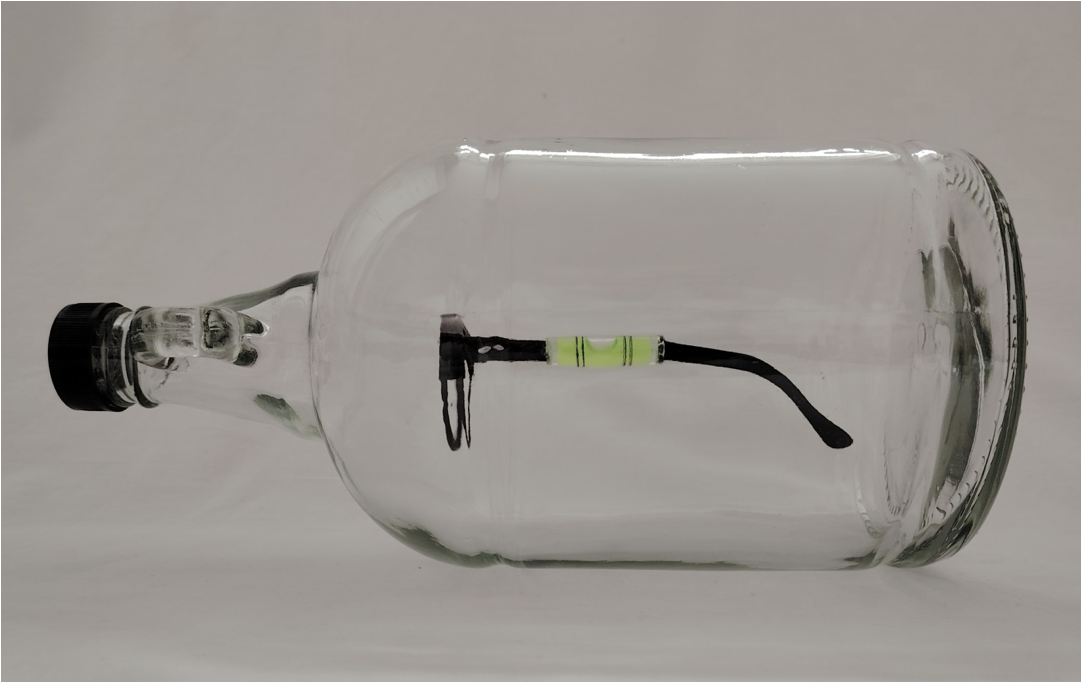
The Measure of Perception, 2023
These works are now nearly a decade old. What does the artist who made them still get right, and what would you argue with him about today?
He still gets a lot right: he began with a question and let it choose the material, he kept returning to an idea until it grew into a project, as Balance did, he refused to make work only for insiders, and he understood that a viewer has to move, physically or mentally, for the work to happen. What I'd argue with is how much he explained. Each statement tells you what every chain and thread stands for. Today I'd keep the images as direct as they are but cut some of the wall text, so the work speaks more and the viewer decides more. I'd also argue with his belief that the concept alone carries a work: researching Conceptual Art has made me pay more attention to how material, space and text carry meaning.
Words copyright of Naso Art Journal.
Images courtesy of Suliman Raqy.
